
BRAND WORLD - STUDIO SOFT SELL
STUDIO SOFT SELL - Built from scratch
Studio Soft Sell was built from zero — name, identity, tone and strategy developed simultaneously to form one coherent brand world.
Soft in appearance. Precise in direction.
Project Scope
Brand Identity — Strategy — Visual System
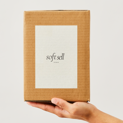
The Mark

The logo was reduced to its essence:
a typographic wordmark without symbol.
Nothing decorative.
Nothing distracting.
Only form, rhythm and spacing.
Soft Sell signals subtlety, trust and quiet confidence — the exact energy the identity is built around.
Every visual element was selected to communicate tactility and calm without losing clarity.
Consistency wasn’t decoration. It was structure.
Naming & Positioning
The name defines the pace before the brand even speaks.
Visual Identity
Every visual element was selected to communicate tactility and calm without losing clarity.
Consistency wasn’t decoration. It was structure.
Color & Type
Color was treated as emotion first, meaning second.
The palette balances warmth and stillness so the brand feels recognizable before it’s fully seen.


Strategy Foundation
Strategy shaped everything underneath.
Mission, tone and direction function as a compass — guiding each visual and communicative decision.
Launch Direction


Launch visuals were designed to introduce the brand through sensation rather than explanation.
Not announcing. Suggesting.
Content System
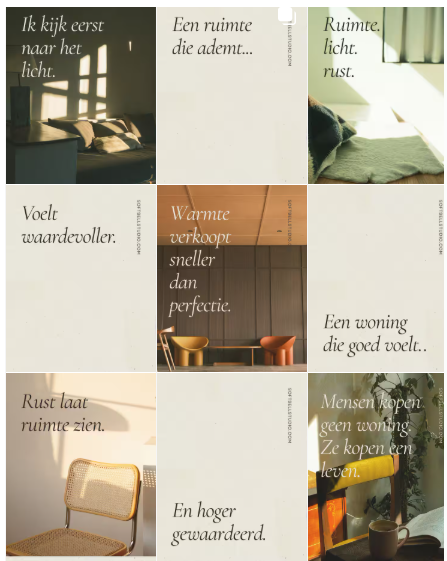
Social direction was defined before publishing began.
Rhythm, format and tone were established so the brand could remain coherent across every platform.
Strategy first.
Aesthetics second.
Always.
